Transform your living space into a masterpiece by mastering the seven fundamental elements of interior design: line, form, space, light, color, texture, and pattern. These essential building blocks work in harmony to create rooms that not only look stunning but feel perfectly balanced and intentionally crafted. Whether you’re refreshing a cozy apartment or designing an entire home, understanding these core elements empowers you to make confident design decisions that reflect your personal style while adhering to time-tested principles. From the way vertical lines can make a room feel taller to how warm colors create intimate spaces, these elements form the foundation of every successful interior design project. Let’s explore each element and discover how they can help you create spaces that are both beautiful and functional, turning design theory into practical solutions for your home.
Space: The Foundation of Design
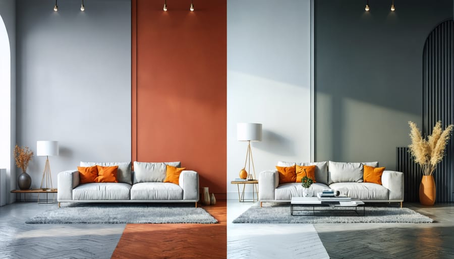
Using Color to Define Space
Color is a powerful tool in interior design that can transform the way we perceive and experience spaces. Strategic use of color helps define distinct zones within a room without the need for physical barriers. For example, using a bold accent wall can create a natural focal point, while coordinating throw pillows and rugs can visually connect separate seating areas.
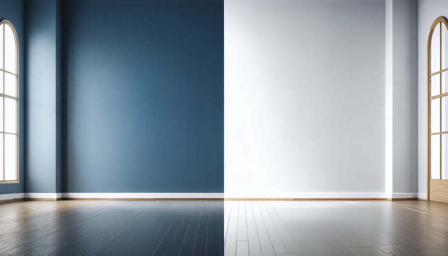
Light colors can make your room look bigger and more open, while darker shades can make spaces feel more intimate and cozy. Try using color blocking techniques to separate functional areas in open-concept spaces – like defining a home office corner with a different wall color than the living area.
The 60-30-10 rule is a helpful guide: use your dominant color for 60% of the space, a secondary color for 30%, and an accent color for the remaining 10%. This creates visual balance while maintaining interest and flow throughout your space. Remember that color temperature also plays a role – warm tones advance while cool tones recede, helping you manipulate spatial perception.
Line: Creating Visual Flow
Color Strategies for Emphasizing Lines
Color can be a powerful tool for either highlighting or downplaying structural lines in your space. To emphasize bold architectural features, try using contrasting colors – for example, painting a dark accent wall behind white crown molding makes the lines pop dramatically. Alternatively, using lighter shades can soften harsh angles and create a more harmonious flow.
Want to make your ceiling appear higher? Paint vertical stripes or use wallpaper with vertical patterns to draw the eye upward. For wider rooms, horizontal lines in complementary colors can help balance the space. Don’t forget about trim work – painting baseboards and door frames in crisp white against colored walls creates definition, while using tone-on-tone colors helps architectural details blend seamlessly.
Pro tip: Before committing to bold color choices, test your combinations with removable paint samples or fabric swatches to ensure they achieve your desired effect with the room’s natural light.
Form: Shaping Room Character
Color’s Impact on Form Perception
Color has a remarkable ability to transform how we perceive forms in a space. Light colors tend to make objects and architectural elements appear larger and more expansive, while darker hues can make them recede visually. This principle is particularly useful when working with challenging room layouts or when you want to highlight specific architectural features.
For instance, painting a bulky column in a light color similar to your walls helps it blend in, minimizing its visual impact. Conversely, using a bold, dark color on a beautifully crafted fireplace mantel draws attention to its form and makes it a striking focal point.
You can also use color to correct perceived proportions. Painting a ceiling in a lighter shade than the walls creates an illusion of height, while using a darker color can make a too-tall ceiling feel more intimate. Similarly, using lighter colors on built-in furniture pieces can make them appear less imposing in a small room.
Light: The Color Enhancer
Natural vs. Artificial Light
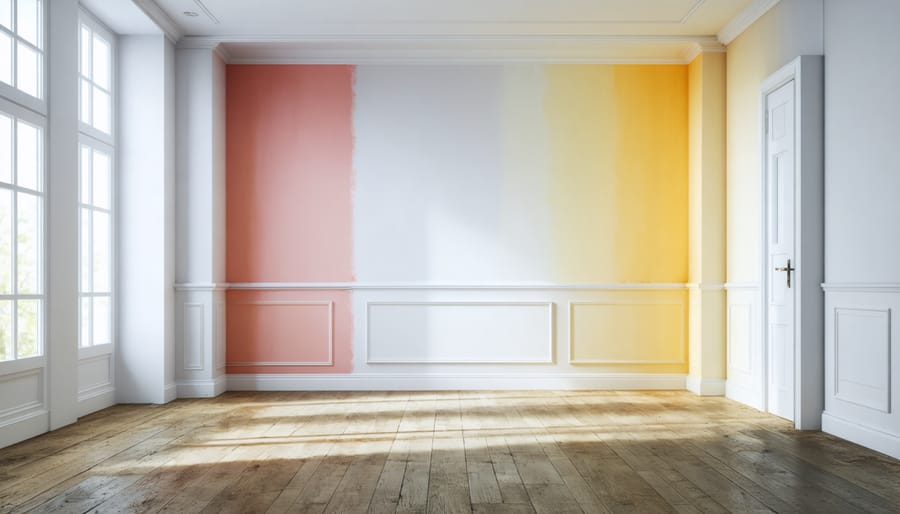
Understanding color psychology in interior design starts with recognizing how different light sources affect our perception of colors. Natural daylight provides the truest color representation, changing subtly throughout the day to create dynamic living spaces. Morning light tends to be cooler and bluer, while evening light casts warmer, golden tones that can dramatically alter how your color choices appear.
Artificial lighting, on the other hand, can either enhance or distort your carefully chosen color palette. LED bulbs offer versatile options, while traditional incandescent bulbs cast a warm yellow glow that can significantly impact light and color harmony. Fluorescent lighting might make warm colors appear dull and cool colors more intense. When planning your interior, consider testing paint samples and fabric swatches under both natural and artificial lighting conditions to ensure your color choices maintain their intended impact throughout the day and evening.
Color: The Heart of Design
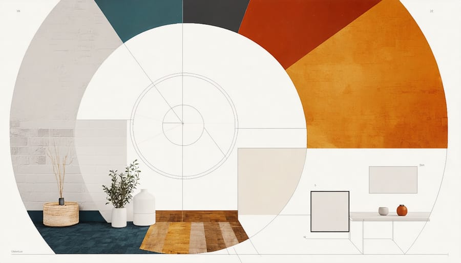
Creating Color Harmony
Creating a harmonious color scheme starts with understanding the color wheel and basic color relationships. Begin by choosing a base color that resonates with your space’s purpose – calming blues for bedrooms, energizing yellows for kitchens, or grounding earth tones for living areas. Apply the 60-30-10 rule: use your dominant color for 60% of the room (walls, flooring), a secondary color for 30% (furniture, curtains), and an accent color for 10% (decorative pieces).
Consider using complementary colors (opposite on the color wheel) for dynamic contrast, or analogous colors (next to each other) for a more subtle flow. Don’t forget about neutrals – they create breathing space and balance bold color choices. Test your colors under different lighting conditions, as natural and artificial light can significantly affect how colors appear throughout the day.
For a foolproof approach, start with a color you love from an existing piece – perhaps artwork or a rug – and build your palette around it. Remember, colors should not only look good together but also create the right mood for your space.
Texture: Adding Depth Through Color
Color-Texture Combinations
Understanding texture and color relationships is crucial for creating visually engaging spaces. Pair rich, dark colors with smooth textures to prevent overwhelming the senses, while lighter hues work beautifully with more pronounced textures like chunky knits or rough stone. Consider combining matte finishes with glossy surfaces to create depth – for example, velvet furnishings in deep navy against sleek, white walls. When working with neutrals, layer different textures to add visual interest: think smooth leather, woven fabrics, and natural wood grain. For bold colors, balance them with subtle textures to avoid visual chaos. Remember that metallic finishes can serve as sophisticated accents across any color palette, adding both texture and reflective properties to your design scheme.
Pattern: The Color Canvas
Balancing Patterns and Colors
Creating harmonious spaces means mastering the art of mixing patterns and colors. Start with a dominant color that sets the mood, then layer in complementary hues using the 60-30-10 rule: 60% primary color, 30% secondary color, and 10% accent color. When incorporating patterns, follow the rule of three – mix large, medium, and small-scale patterns while keeping at least one element consistent, such as color or style.
For a balanced look, combine geometric patterns with organic ones, and vary the scale to create visual interest. Keep busy patterns to smaller pieces like throw pillows or artwork, while using solid colors for larger furniture pieces. Remember to include neutral elements to give the eye a place to rest, and don’t forget to test your combinations in the actual room lighting before committing.
Understanding and mastering the seven elements of interior design – space, line, form, light, color, texture, and pattern – is your key to creating harmonious and inviting spaces. Each element works in concert with the others to establish a cohesive design that reflects your personal style while maintaining visual balance. As you begin your design journey, start by evaluating your space through the lens of each element. Consider how your current room arrangements utilize these principles and where improvements can be made. Remember, you don’t need to tackle everything at once – start with one element, perhaps color or lighting, and gradually incorporate the others as you become more confident. The most successful interior designs are those that evolve thoughtfully over time, allowing you to experiment and discover what truly works for your space and lifestyle.