Colors shape our emotions, behaviors, and daily experiences in profound ways that science is only beginning to fully understand. Research into color psychology reveals that our responses to different hues aren’t merely personal preferences – they’re deeply rooted in both our evolutionary history and cultural conditioning.
From the calming effects of soft blues to the appetite-stimulating properties of warm reds, color psychology has evolved from ancient wisdom into a research-backed field with practical applications in everything from marketing to mental health therapy. Studies show that up to 90% of snap judgments about products can be based on color alone, while healthcare facilities have documented improved patient recovery rates in rooms designed with specific color schemes.
Modern neuroscience has revealed that colors trigger specific neural pathways, influencing our hormone production, heart rate, and even cognitive performance. This isn’t just fascinating science – it’s a powerful tool for creating spaces that enhance our wellbeing, productivity, and emotional state.
Whether you’re redesigning your home office for maximum focus or creating a relaxing bedroom sanctuary, understanding the proven psychological effects of color choices can help you make informed decisions that align with your goals. Let’s explore how you can harness this knowledge to transform your living spaces through the strategic use of color.
The Science Behind Color Perception
Your Brain on Color
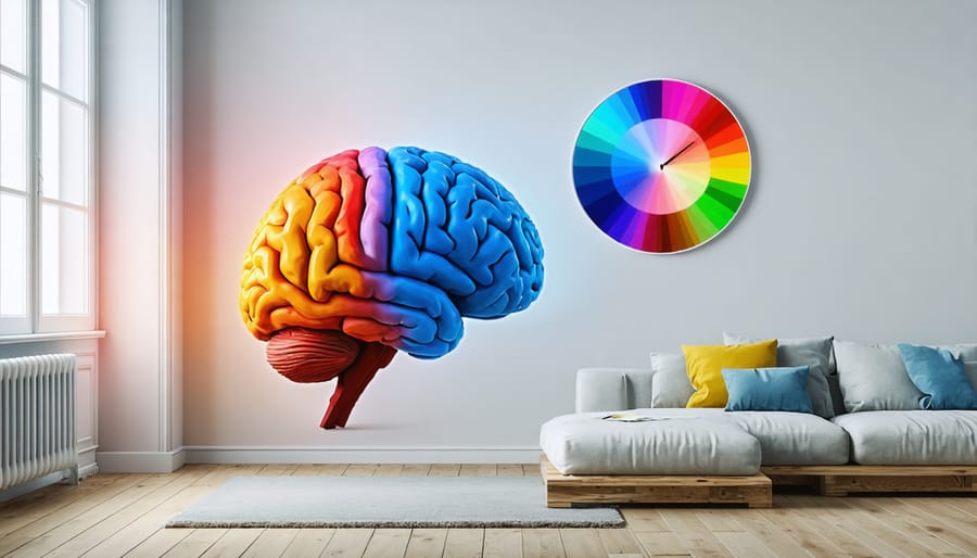
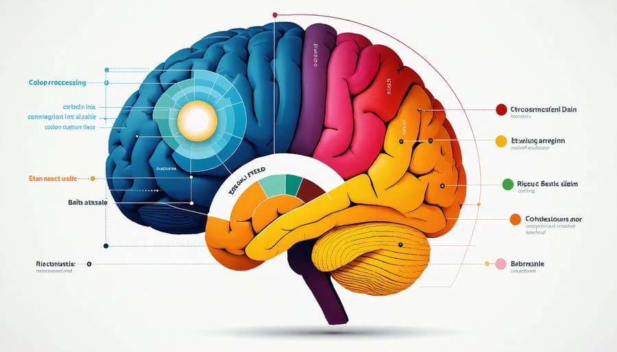
Ever wonder why certain colors make you feel energized while others help you relax? It all comes down to how your brain processes color. When light enters your eyes, it triggers a fascinating chain reaction in your neural pathways. Your retina contains special cells called cones that detect different wavelengths of light, sending signals straight to your brain’s visual cortex.
But it doesn’t stop there! These color signals travel to different brain regions, including the hypothalamus, which influences our hormones and the amygdala, which processes emotions. This explains why a soft blue might lower your blood pressure, while a vibrant red can increase your heart rate.
Think of your brain as a sophisticated color interpreter. When you walk into a room, it’s not just seeing colors – it’s creating emotional and physical responses based on your personal experiences and cultural background. This is why a sunny yellow kitchen might make one person feel cheerful while reminding another of a less pleasant memory.
Understanding these neural pathways helps explain why color choices in your home matter so much. It’s not just about aesthetics – it’s about creating spaces that work with your brain’s natural responses to support your well-being and daily activities.
The Emotional Color Map
Research has consistently shown that emotional responses to colors are deeply rooted in both psychology and cultural conditioning. Different hues can trigger specific emotional reactions, influencing our mood and behavior in powerful ways.
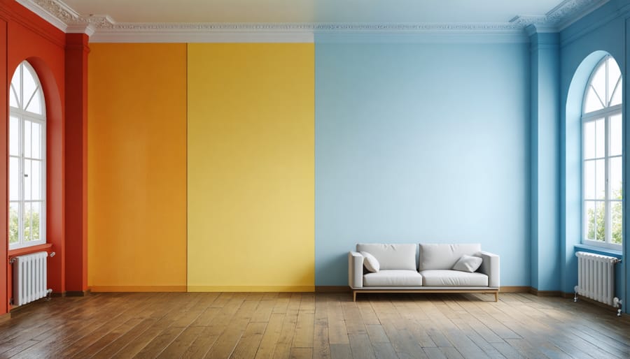
Red, for instance, has been found to increase heart rate and energy levels, making it an excellent choice for social spaces but potentially overwhelming in bedrooms. Blue, on the other hand, tends to lower blood pressure and create a sense of calm, explaining its popularity in bedrooms and offices.
Yellow stimulates mental activity and promotes optimism, though research suggests that too much exposure can increase anxiety levels. Green strikes a perfect balance, as studies show it reduces eye strain and promotes feelings of harmony – perhaps due to its abundant presence in nature.
Purple often evokes feelings of luxury and creativity, while orange combines the energy of red with the cheerfulness of yellow, making it ideal for exercise rooms or creative spaces. White creates a sense of spaciousness but can feel cold without warm accents, while black adds drama and sophistication when used strategically.
Understanding these emotional connections helps you make informed choices about your home’s color scheme, creating spaces that not only look beautiful but also support your emotional well-being.
Color Psychology in Living Spaces
Energizing vs. Calming Spaces
Creating the right energy in different rooms of your home is essential for both functionality and well-being. Colors play a crucial role in setting these moods, and understanding how to use them effectively can transform your living spaces.
For energizing spaces like home offices, kitchens, or workout areas, warm and vibrant colors are your best allies. Bright yellows can boost creativity and mental activity, making them perfect for home offices or craft rooms. Orange tones can stimulate appetite and social interaction, ideal for dining rooms and kitchen spaces. Red accents, when used strategically, can increase energy levels and create dynamic environments perfect for exercise areas or playrooms.
On the flip side, calming spaces require cooler, softer tones that help reduce stress and promote relaxation. Bedrooms and bathrooms benefit from gentle blues, which can lower blood pressure and heart rate, creating a peaceful atmosphere conducive to rest. Soft greens remind us of nature and can create a balanced, harmonious environment perfect for reading nooks or meditation spaces. Lavender tones can help ease anxiety and promote better sleep quality.
When designing these spaces, remember that you don’t need to paint entire rooms in these colors. Consider using the 60-30-10 rule: 60% of the room in a dominant color, 30% in a secondary color, and 10% in accent colors. This creates visual balance while maintaining the desired energy level.
For energizing spaces:
– Use colors in their pure, saturated forms
– Incorporate patterns and contrasts
– Add metallic or glossy finishes
For calming spaces:
– Choose muted or pastel versions of colors
– Stick to monochromatic or analogous color schemes
– Use matte finishes for a softer feel
Remember that personal preferences and cultural associations can influence how colors affect us, so always test samples in your space before making major changes.
Color Combinations That Work With Your Brain
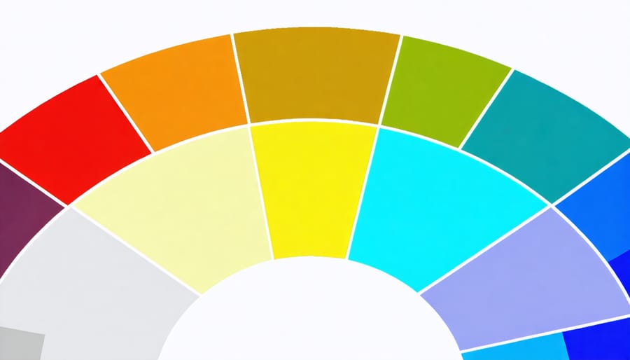
Ever wondered why certain colors just feel right together? Science shows that our brains are naturally wired to respond to specific color combinations that work in harmony. Let’s explore some scientifically-proven color schemes that can enhance your space and well-being.
Blue and green combinations mirror nature’s palette and have been shown to reduce stress levels and promote focus. This pairing works particularly well in home offices and bedrooms, where calm and concentration are key. Studies have found that exposure to these colors can lower heart rate and blood pressure.
For spaces where creativity flows, try purple and yellow. This complementary duo stimulates both sides of the brain – purple encourages imaginative thinking while yellow boosts energy and optimism. Perfect for art studios or children’s play areas.
Want to create a sociable dining space? Orange and warm neutrals encourage conversation and appetite. Research indicates that warm colors can increase social interaction and make time pass more quickly, ideal for entertaining areas.
For ultimate relaxation, combine soft blues with gentle grays. This combination has been proven to slow down our perception of time and reduce anxiety levels. Consider this palette for bathrooms or meditation spaces.
Here’s a practical tip: the 60-30-10 rule helps balance these combinations effectively. Use your primary color for 60% of the space, a secondary color for 30%, and an accent color for 10%. This ratio works with our brain’s natural ability to process visual information.
Remember that lighting plays a crucial role in how our brains perceive these combinations. Natural daylight shows colors most accurately, while artificial lighting can alter how these combinations appear and affect our response to them. Consider testing your chosen palette under different lighting conditions before committing to a final design.
Practical Color Selection Tips
Room-by-Room Color Strategy
Each room in your home serves a unique purpose, and the colors you choose should support these functions. Let’s explore the most effective color choices for different spaces in your home.
Living Room
For this social hub, warm and welcoming colors create an inviting atmosphere. Consider soft earth tones like sage green or warm beige to promote conversation and relaxation. If you’re feeling bold, deep blues can add sophistication while maintaining a calm environment.
Kitchen
Since kitchens are high-energy spaces, colors that stimulate appetite and encourage activity work best. Yellow brings cheerfulness and energy, while warm whites keep the space feeling clean and fresh. For a modern twist, try incorporating soft grays with colorful accents.
Bedroom
Your sleep sanctuary benefits from calming, restorative colors. Soft blues and gentle greens promote restfulness, while lavender has natural calming properties. Avoid energetic reds or bright yellows, which can interfere with sleep quality.
Home Office
Focus and productivity thrive in spaces with balanced color schemes. Medium blues boost concentration, while gentle greens reduce eye strain and promote creativity. Keep the palette professional but not sterile by adding warm neutral accents.
Bathroom
Create a spa-like atmosphere with cool, clean colors. Soft whites, pale blues, and gentle greens evoke cleanliness while promoting relaxation. For powder rooms, you can be more adventurous with deeper tones or playful patterns.
Children’s Rooms
While bright colors are often associated with kids’ spaces, balance is key. Combine calming base colors with energetic accents. Consider how the colors will grow with your child, and opt for easily updateable accent pieces rather than permanent bold choices.
Remember to test paint samples in your specific space and observe how they look throughout the day, as natural and artificial lighting can significantly impact color appearance. Start with smaller areas if you’re unsure about a color choice, and build your confidence as you see the positive effects in each room.
Testing Colors in Your Space
Before committing to a full room makeover, testing colors in your space is essential for ensuring successful results. Start by purchasing sample paint pots or collecting large color swatches from your local home improvement store. Paint generous squares (at least 2 feet by 2 feet) on different walls in your room, as colors can appear dramatically different depending on light exposure and surrounding elements.
Observe these test patches throughout the day, noting how they look in morning light, afternoon sun, and artificial evening lighting. Take photos at different times and refer to them later – sometimes a color that looks perfect in person might appear quite different in photographs, which can help you notice undertones you might have missed.
Consider creating a mood board with your chosen color alongside fabric swatches, flooring samples, and images of furniture pieces you plan to keep. This helps you visualize how all elements will work together before making any permanent changes. Many paint manufacturers now offer peel-and-stick samples, which are perfect for temporary placement without damaging your walls.
For those tech-savvy decorators, try using color visualization apps that let you virtually paint your space using photos of your actual room. While these tools aren’t perfect, they can provide a helpful preview of how different colors might transform your space.
Remember to test colors against your existing lighting fixtures, as the type of bulbs you use (warm or cool) can significantly impact how colors appear. If possible, borrow or purchase small décor items in your chosen color to scatter throughout the room – this gives you a better sense of how the color will feel when it’s actually living in your space.
Give yourself at least a week to live with your test colors. Your initial reaction might change as you adjust to seeing the color in different contexts and situations.
Color psychology is a powerful tool that can transform your living spaces and significantly impact your daily life. As we’ve explored throughout this article, colors do more than just beautify our surroundings – they influence our emotions, behavior, and overall well-being in scientifically proven ways.
Remember that while color psychology provides valuable guidelines, personal preferences and cultural associations also play important roles in how colors affect us. The key is to strike a balance between following established color principles and choosing shades that resonate with you personally.
When planning your next home improvement project, take time to consider the psychological impact of your color choices. For bedrooms, consider calming blues or gentle greens to promote relaxation. In home offices, productive yellows or energizing oranges might be more appropriate. Social spaces like living rooms can benefit from warm, welcoming tones that encourage conversation and connection.
Start small by experimenting with accent pieces or a feature wall before committing to major color changes. Pay attention to how different colors make you feel in various spaces and lighting conditions. Don’t be afraid to adjust your choices based on your experiences and responses.
By thoughtfully applying color psychology principles in your home, you can create spaces that not only look beautiful but also support your emotional well-being and daily activities. The power to transform your environment – and your life – is quite literally in your hands, one color choice at a time.