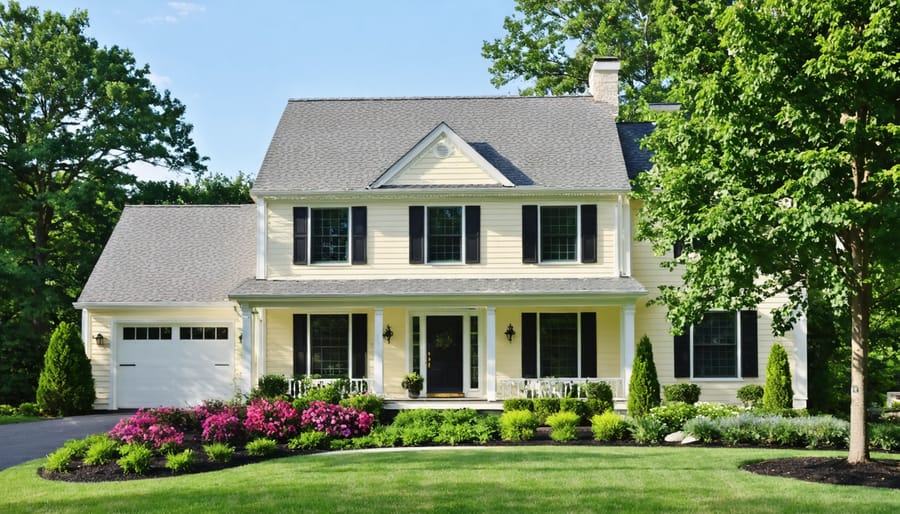
Transform your home’s exterior with timeless cream paint colors that enhance curb appeal and create an inviting atmosphere. From warm vanilla bean to sophisticated antique white, cream exteriors offer incredible versatility while hiding dirt and imperfections better than stark whites. Perfect for both traditional and modern homes, these neutral hues pair beautifully with any trim color and architectural style.
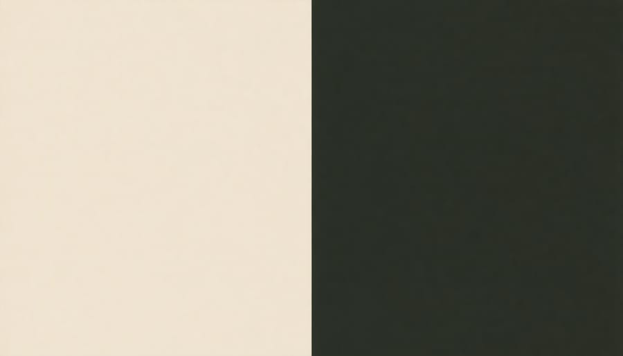
Select your ideal cream shade by first identifying your home’s undertones – whether warm yellow-based or cool gray-based – to ensure harmony with existing elements like roof color, stonework, and landscaping. Consider testing 3-4 samples on different sides of your house to observe how natural light affects the color throughout the day. The most popular cream exterior choices include Benjamin Moore’s Swiss Coffee, Sherwin-Williams’ Alabaster, and Farrow & Ball’s White Tie – each offering distinct levels of warmth and depth while maintaining that perfect balance between white and beige.
With cream’s enduring popularity in residential architecture, choosing the right shade not only creates instant curb appeal but also provides excellent resale value. Get ready to discover the perfect cream exterior paint color that will transform your home into the neighborhood standout you’ve always envisioned.
Why Cream Colors Work Magic on Home Exteriors
Cream colors have earned their reputation as a go-to choice for exterior home painting, and for good reason. These warm, inviting hues create an instant charm that can transform any house into a welcoming haven. Like magic, cream shades work wonders in brightening dark exterior spaces while maintaining a sophisticated appearance that stands the test of time.
One of cream’s greatest strengths is its remarkable versatility with trim colors. Whether you’re drawn to crisp whites, deep browns, or bold blacks for your accents, cream provides an elegant backdrop that enhances rather than competes with other elements. This adaptability makes it easier to update your home’s look in the future without a complete color overhaul.
Cream colors also excel at masking architectural imperfections that might otherwise draw unwanted attention. Minor wall irregularities, patches, or subtle structural variations tend to blend seamlessly when painted in cream tones, creating a more polished overall appearance. This forgiving quality is particularly valuable for older homes or those with mixed materials on their exterior.
When it comes to curb appeal, cream colors deliver impressive results. They photograph beautifully, which is crucial for resale value in our digital age, and they create an inviting first impression that appeals to a broad range of tastes. The subtle warmth of cream also helps your home stand out naturally without appearing flashy or dated.
Perhaps most importantly, cream exteriors maintain their fresh appearance longer than many other colors. They show less dirt and weathering than pure whites, yet still reflect enough light to keep your home looking bright and well-maintained. This practical benefit means less frequent touch-ups and longer periods between complete repaints, making cream an economically sound choice for the long term.
Most Popular Cream Exterior Paint Colors
Warm Cream Shades
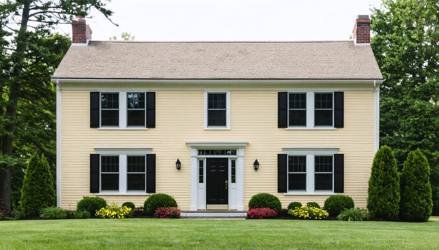
For homeowners seeking a timeless and inviting exterior, warm cream shades offer the perfect balance of sophistication and welcoming charm. These yellowy cream tones work particularly well on traditional architectural styles, from Colonial and Victorian to Mediterranean homes.
Popular choices like Benjamin Moore’s Manhattan Mist and Sherwin-Williams’ Creamy create a soft, buttery appearance that catches natural light beautifully throughout the day. These shades provide enough warmth to make your home feel inviting without appearing too yellow or dated.
When selecting a warm cream for your exterior, consider how it pairs with your roof color and existing stonework. The best yellowy creams have a slight golden undertone that complements brick and natural stone while maintaining a neutral presence. They’re especially striking when paired with crisp white trim and dark shutters.
These colors also have practical benefits – they hide dirt and imperfections better than stark whites, and their warmth helps mask any slight discoloration that might occur over time. For the best results, test your chosen shade on different sides of your house to see how it looks in various lighting conditions throughout the day.
Remember to consider your neighborhood’s overall aesthetic while selecting your shade. A warm cream exterior can help your home stand out tastefully while maintaining harmony with surrounding properties.
Cool Cream Options
For those seeking a contemporary twist on classic cream, greige-leaning options offer the perfect balance between warmth and sophistication. These modern cream colors blend the coziness of traditional cream with subtle gray undertones, creating a versatile exterior that feels both timeless and current.
Benjamin Moore’s White Wisp is a standout choice, offering a light, airy cream with just enough gray to feel distinctly modern. This color adapts beautifully to changing light conditions and pairs wonderfully with both warm and cool accent colors.
Sherwin-Williams’ Alabaster has become increasingly popular for its perfect balance of cream and greige notes. It creates a soft, welcoming facade while maintaining a clean, current aesthetic that works especially well on modern farmhouse and contemporary architectural styles.
Another excellent option is Behr’s Cotton Knit, which leans slightly warmer while still incorporating those sought-after greige undertones. This color is particularly effective on homes with lots of architectural details, as it provides enough contrast to highlight trim work and dimensional elements.
When working with these cooler cream options, consider your home’s fixed elements like roof color and stonework. These modern creams tend to look best when paired with darker gray or charcoal roofs and natural stone elements in similar cool tones. For trim colors, both crisp whites and deep charcoals can create stunning contrasts that enhance the sophisticated nature of these contemporary creams.
Neutral Cream Selections
Neutral cream colors offer timeless elegance and remarkable versatility for any home’s exterior. These balanced hues strike the perfect middle ground between warm and cool undertones, making them ideal for various architectural styles, from Colonial to Contemporary.
Swiss Coffee stands out as a classic choice, offering a soft, warm cream that isn’t too yellow or stark. This versatile shade works beautifully with both traditional trim colors and modern accent pieces. Dover White provides another excellent option, delivering a clean, fresh cream that maintains warmth without appearing too beige or yellow.
For those seeking a slightly deeper neutral cream, consider Natural Cream. This sophisticated shade carries subtle golden undertones that add depth without overwhelming the exterior. It pairs exceptionally well with earth-toned landscaping and natural stone features.
Alabaster represents perhaps the most balanced neutral cream available. Neither too warm nor too cool, it creates a timeless backdrop that complements virtually any accent color or architectural detail. This adaptable shade looks equally stunning on a craftsman bungalow or a modern farmhouse.
When selecting a neutral cream, consider how the color appears at different times of day. These shades tend to maintain their character regardless of lighting conditions, making them particularly reliable choices for exterior applications. Test your chosen color on multiple sides of your home to ensure it maintains its neutral qualities throughout the day.
Choosing the Perfect Cream Color
Consider Your Home’s Architecture
Your home’s architectural style plays a crucial role in choosing the right paint shade. Traditional Colonial homes shine with warmer cream tones that highlight their classic symmetry and detailed trim work. For Mediterranean-style houses, consider rich, buttery creams that complement terracotta roofs and ornate details. Modern and contemporary homes often work best with cooler, more minimal cream shades that emphasize clean lines and geometric features.
Victorian homes can handle more complex cream variations, especially when highlighting their intricate architectural details. For Craftsman-style homes, earthier cream tones complement the natural materials and exposed woodwork characteristic of this style. Ranch-style houses benefit from lighter, brighter creams that create a welcoming, horizontal presence.
Remember that your home’s existing elements, like brick, stone, or wooden features, should inform your cream color selection. The right shade will enhance these materials rather than compete with them, creating a cohesive exterior that honors your home’s architectural heritage while maintaining its curb appeal.
Factor in Natural Light
When choosing the perfect cream exterior paint color, understanding how natural light affects paint colors is crucial for achieving your desired result. Sunlight exposure varies throughout the day and can dramatically impact how cream shades appear on your home’s exterior.
South-facing walls receive the most direct sunlight, making cream colors appear brighter and warmer. Consider choosing slightly cooler cream tones for these areas to balance the warming effect. North-facing walls, which receive less direct light, tend to make colors appear cooler and slightly darker. Here, warmer cream shades can help create a more welcoming appearance.
East and west-facing walls experience changing light conditions throughout the day. Morning light has a cool, blue quality, while afternoon sun casts warmer, golden tones. Test your cream paint samples at different times of day to ensure you’re happy with how the color transforms.
Remember that your local climate and surrounding landscape can also influence how sunlight interacts with your chosen cream shade. Homes in bright, sunny regions might benefit from creamier whites, while those in overcast areas could use richer, warmer creams to maintain their vibrancy.
Coordinate with Fixed Elements
When selecting the perfect cream exterior paint, it’s essential to coordinate with fixed elements around your home. Start by examining your roof color – warm cream tones pair beautifully with brown or terracotta roofs, while cooler creams complement gray or black shingles. For homes with existing stonework, choose a cream shade that picks up the undertones in your stone features. Light creamy beiges work well with tan or brown stones, while ivory-based creams complement gray or white stonework.
Consider your landscaping when selecting your cream shade. If you have lots of greenery, warmer cream colors can create a harmonious natural look. For homes with flowering gardens, choose a cream that won’t compete with your blooms but rather provides a neutral backdrop that lets your landscaping shine.
Don’t forget about architectural features like brick foundations or wooden trim. A slightly contrasting cream can highlight these elements while maintaining a cohesive look. Test paint samples at different times of day to see how natural light affects the color’s appearance alongside these fixed features. Remember that cream colors can appear differently depending on your home’s exposure to sunlight and surrounding elements, so take time to observe these interactions before making your final choice.
Expert Application Tips
Surface Preparation
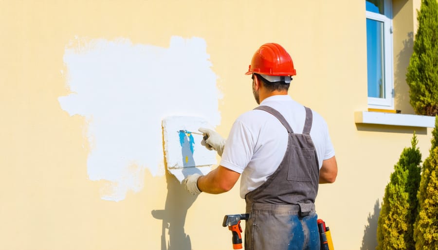
Before applying your chosen cream exterior paint, proper surface preparation is essential for a flawless, long-lasting finish. Start by thoroughly cleaning the exterior walls using a pressure washer or a mixture of water and mild detergent. Remove any dirt, mildew, or loose debris that could affect paint adhesion.
Next, repair any damaged areas by filling cracks, holes, or gaps with exterior-grade caulk or patching compound. Sand down rough spots and scrape away peeling or flaking paint until you reach a solid surface. Pay special attention to areas around windows, doors, and trim where moisture tends to accumulate.
If your house has older paint layers, test for lead paint if your home was built before 1978. Should you find lead paint, consult a professional for safe removal. For homes with bare wood surfaces, apply a quality exterior primer designed for your specific surface material.
Allow all repaired areas to dry completely before moving forward. Check the weather forecast and plan your painting project for a period of dry, mild weather with temperatures between 50-85°F. Protect your landscaping by covering plants and shrubs with drop cloths, and tape off areas you don’t want painted, such as windows and door hardware.
Remember that the time invested in proper surface preparation will directly impact your cream paint’s final appearance and durability. Don’t rush this crucial step!
Application Techniques
Achieving a flawless cream exterior finish starts with proper preparation. Begin by thoroughly cleaning your home’s exterior, removing any dirt, mold, or loose paint. Repair any cracks or damages, and don’t skip the crucial step of priming, especially if you’re making a significant color change.
For the best results, choose a day with mild temperatures (between 50-85°F) and low humidity. Avoid painting in direct sunlight or when rain is forecasted within 24 hours. Start from the top of your house and work your way down, ensuring consistent coverage as you go.
When applying cream exterior paint, use high-quality brushes and rollers specifically designed for exterior surfaces. The two-coat method is recommended: apply thin, even coats rather than one thick layer, allowing proper drying time between applications. Pay special attention to trim work and corners, where cream colors can show inconsistencies more readily.
For spray application, maintain a steady distance of 12 inches from the surface and use overlapping strokes for even coverage. Don’t forget to protect surrounding areas with drop cloths and painter’s tape. Remember that cream colors may require an additional coat compared to darker shades to achieve optimal coverage.
Keep touch-up paint stored in a sealed container for future maintenance, and label it with the exact color code and brand for perfect matching later on.
Choosing the perfect cream exterior paint color doesn’t have to be overwhelming. With the wide range of stunning options available, from warm vanilla to sophisticated antique white, there’s an ideal shade for every home style and personal preference. Remember to consider your home’s architectural features, surrounding landscape, and natural lighting when making your selection. Always test your chosen colors with sample swatches in different lighting conditions before making the final decision. Whether you opt for a classic warm cream or a modern greige, your choice will create a welcoming, timeless exterior that enhances your home’s curb appeal. Trust your instincts, take inspiration from our recommendations, and embrace the transformative power of cream exterior paint to create the home of your dreams.